Setting Project display options
The Project panel’s Settings tab includes options to set the appearance of the graph space and the project-wide appearance of nodes and edges.
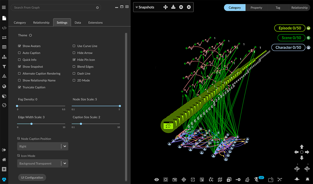
Setting display of the graph space
For the graph space, you can choose a dark or light theme, and to show or hide the Snapshots window and information panels. You can also scale color density of nodes and edges to enhance 3D visualization.
To set display of the graph space:
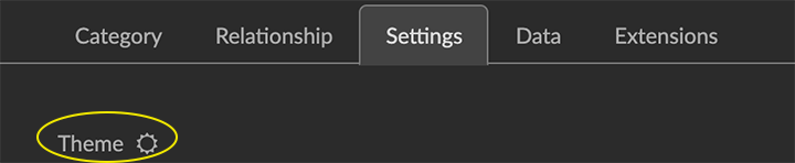
Click to open the Project Panel and Settings tab.
Set one or more of the following display options:
Click the Theme icon to toggle between the default dark mode and light mode.
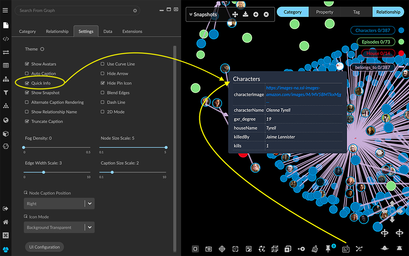
Click the Quick Info checkbox to display an information pane when you roll over a node or edge. You can also use the Quick Info icon in the context menu to toggle the rollover info pane on and off.
Click the Show Snapshot checkbox to display the menu bar for the floating Snapshots window. This lets you display the SnapShots dialog in the graph space only when you need it.
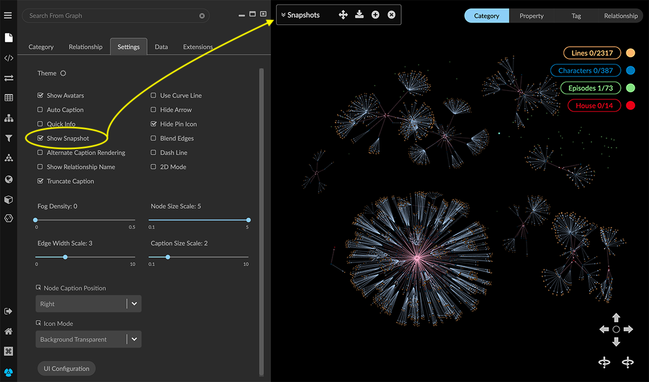
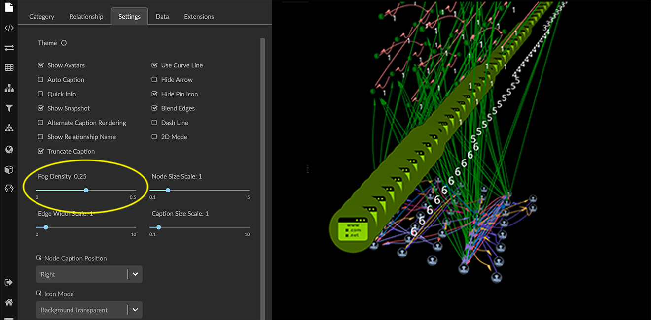
Use the Fog Density slider to enhance (or reduce) the impression of a 3D space by scaling color density of nodes and edges depending on how close or far away from the viewer they are in the virtual 3D space. A fog density of zero (0) results in crisp rendering of all graph elements.
Setting display of nodes
You can scale the size of nodes and their captions, control whether an image or the pin icon is displayed on the node, and select an icon sheet for the project.
In the legend list, click the colored dot next to an item to display its styling setting dialog. It lets you set the Color and Icon for nodes of a specific category, and choose properties used for the Avatar image, relative node Size, and Captions. These display options are also available in the Project panel and Category tab.
To set display of nodes:
Click to open the Project Panel and Settings tab.
Set one or more of the display options for nodes, as outlined below.
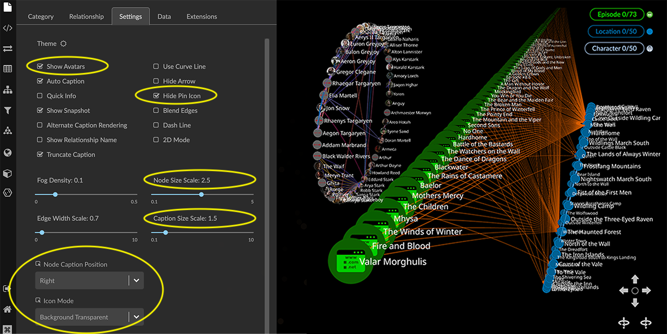
Show Avatars checkbox. Show images associated with nodes through a URL property of its Category. An attempt to load an image will be made for any property key of _photo, photo, avatar, image, picture, or icon which has a property value starting with http, https, or ftp.
Formats supported are jpg, jpeg, png, gif, bmp.
An available image appears when you zoom in to a fixed virtual distance from the node. If you have also applied an icon to a node, the avatar is displayed with a small icon badge. Further out from that point, the color and icon selected for the Category is displayed instead.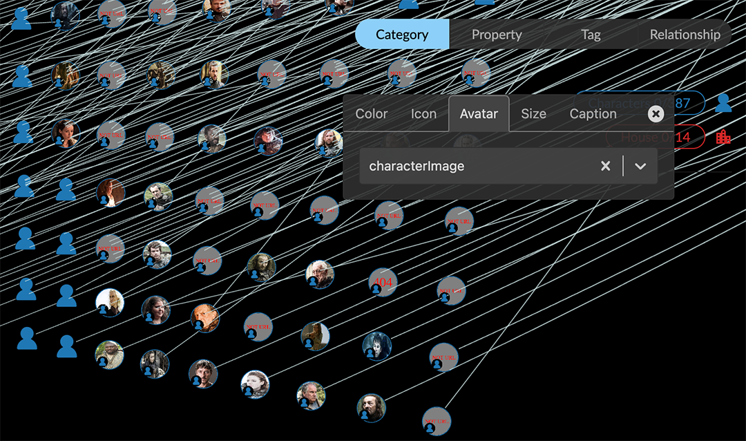
To specify the property used for an avatar, in the legend, click the colored dot next to a category label. In the styling setting dialog click the Avatar tab, and select the property from the dropdown menu. Or, you can go to the Project>Category tab, and click the Avatar URL checkbox for the category and property you want.
To speed up navigation in the graph space, you may want to deselect the Show Avatars checkbox. You can still use the styling dialog to choose a property, but the images will not be displayed until you select Show Avatars again.Hide Pin Icon checkbox. Hide the Pin icon that displays on a pinned node. The Pin icon can obscure graph patterns you want to visualize using color and added icons or images.
Node Size Scale slider. Set a global value for the size of all nodes. This value is applied independent of mapping node size to one of its properties, and preserves the relative scale of different sized nodes.
Caption Size Scale slider. Set a global value for the size of captions for both nodes and edges.
Node Caption Position dropdown menu. Position options are Right, Top (left-aligned or centered), Bottom (left-aligned or centered), and Vertical.
Icon Mode dropdown menu. Set a display mode for icons overlaid on nodes.
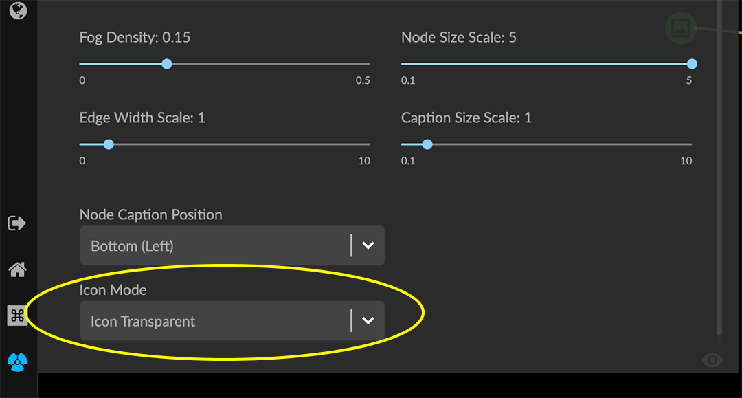
Options are:
Background Transparent. Removes the node background. Only the icon is colored and the rest of the node circle is transparent.
Icon Transparent. Makes the icon transparent, and overlays it on the node circle.

Mix Color. Automatically selects a lighter, contrasting hue for the icon and overlays it on the node circle.

Setting display of edges
Options for displaying edges let you scale edge width and caption size, use a curved or straight line, show or hide directional arrowheads, display edges as dashed lines, and display a blended, lighter color for edges that overlay one another.
Setting the color of edges by relationship is done either in the Project panel and Relationships tab, or by clicking the colored line next to a relationship in the Legend list. Captions for edges, like those for nodes, are derived from one or more property values. You can set them in the Project panel and Relationship tab using the AsCaption property checkboxes, or by using the Legend’s styling setting dialog and Caption tab.
To set display of edges:
Click to open the Project panel and Settings tab.
Set one or more of the following display options for edges:
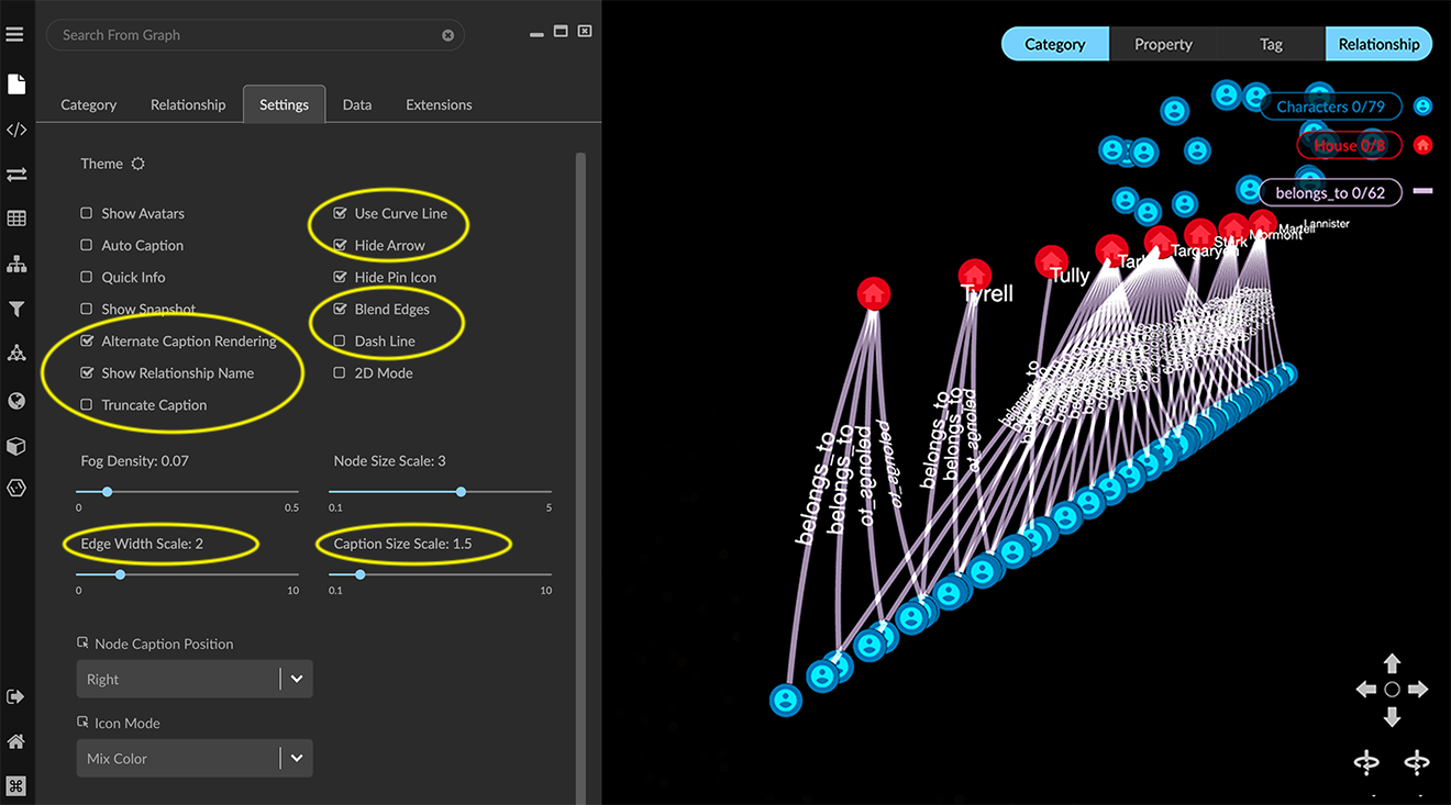
Alternate Caption Rendering checkbox. Use a more compact rendering of captions which may be more legible.
Show Relationship Name checkbox. Label every edge with its relationship name.
Use Curve Line checkbox. Represent edges as curved lines rather than straight lines. This is especially useful when pairs of nodes in a graph share multiple relationships.
Hide Arrow checkbox. Hide the arrowheads that show the edge direction.
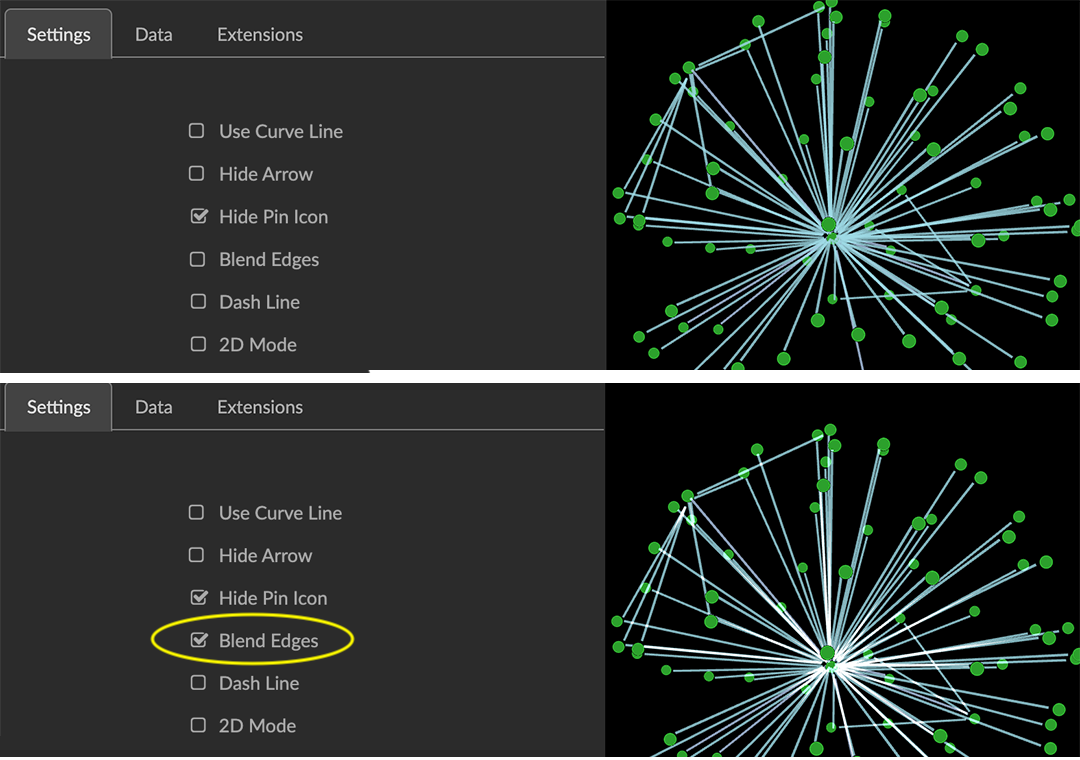
Blend Edges checkbox. This enables additive blending of edge color such that multiple edges stacked on top of one another will appear brighter.
Dash Line checkbox. Render edges as a dashed, rather than a solid line.
Edge Width Scale slider. Set a global value for the width of all edges.
Caption Size Scale slider. Set a global value for the size of captions for both nodes and edges.