Setting Colors, Captions, Icons, and Images
Applying color, icons, avatar images, and captions and scaling node size or edge width based on a property value lets you highlight patterns, select data for further analysis and transformation, and create compelling visualizations.
Categories, relationships, property values, and tags are assigned colors automatically. At any time, you can:
Change the color assigned to a category, and the color assigned to a relationship, tag, or property value.
Apply an icon to the nodes of a category, or to nodes with a specific property value or tag using a searchable icon library available in the styling dialog. In the Settings panel, the Icon Mode menu enables you to select one of three global coloring modes.
Label nodes and edges with captions derived from a category’s property values.
Scale the size of the nodes of a category or edges of a relationship using a property value.
Selecting a color
You can set a color for a category, relationship, tag, or property value using the list in the Legend. Clicking the colored dot next to any list item displays a styling dialog which provides separate Color, Icon tabs.
You can also select a new color and icon for a category or a relationship color in the Project panel’s Category or Relationship tab. Select a category (or relationship) and click its colored circle (or rectangle) to display the color and icon pickers.
To select a color:
Go to the Legend and click the Category, Relationship, Tag, or Property tab.
Locate the item in the list, or for a Property, select a property name from the dropdown menu and then locate the list item for one of its values.
Click the colored dot or line at the right of the item to display a color picker.
In the Styling Setting dialog, click one of the pre-set colored dots, use the color palette to select the color of your choice, or enter the hex value for the color.
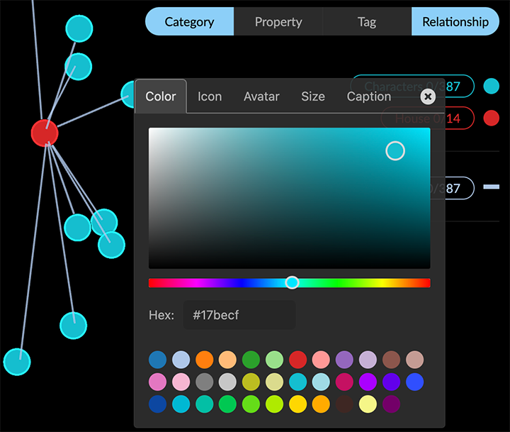
The new color is applied immediately.
Click the X at the upper right to close the dialog.
Setting colors scaled by a property value
You can assign a color scale or gradient for a category’s numerical or date property value using the list in the Legend.
To set a color scale for a property:
Go to the Legend and click the Property tab.
Select a property name from the dropdown menu. The menu includes the properties of all visible categories, in alphabetic order.
Click the Use Scale Color checkbox, and choose a color scale from the additional dropdown menu.
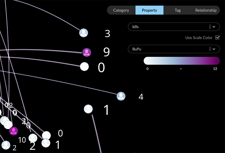
In the example above, the BuPu scale colors visible Character nodes according to their kills property value, on a gradient with a lowest value assigned a pale blue, and the highest a dark purple.
All nodes of the category are colored, whether selected or not. Hidden nodes are colored as soon as they are restored to the graph space.
Selecting an icon
Using the lists in the legend, you can apply an icon as well as a color to nodes of a specific category, tag, or property value. Clicking the colored dot next to a list item displays a styling dialog. In its Icon tab, you can search for an icon by name, or use the dropdown menu to display a palette of related icons.
Selecting an icon for the nodes of a category
You can apply an icon to all the nodes of a category. Icons are colored according to your current color choice and coloring mode.
To set the coloring mode for icons, go to Project -> Settings and use the Icon Mode menu at the bottom of the panel.
To select an icon for a category:
Go to the legend and click the Category tab.
Locate the Category in the list (e.g. Characters) and click the colored dot at the right to display the styling dialog. (You can also access the styling dialog in the Projects panel and Category tab.)
Click the Icon tab to display the icon picker. To locate icons, you can
- Search by name (e.g. “person”).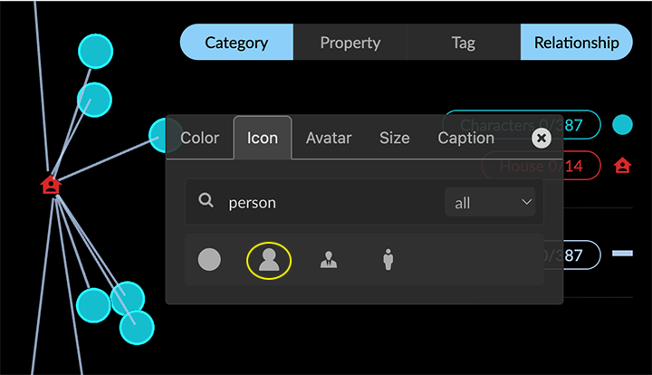
- Use the dropdown menu to display groups of similar icons.
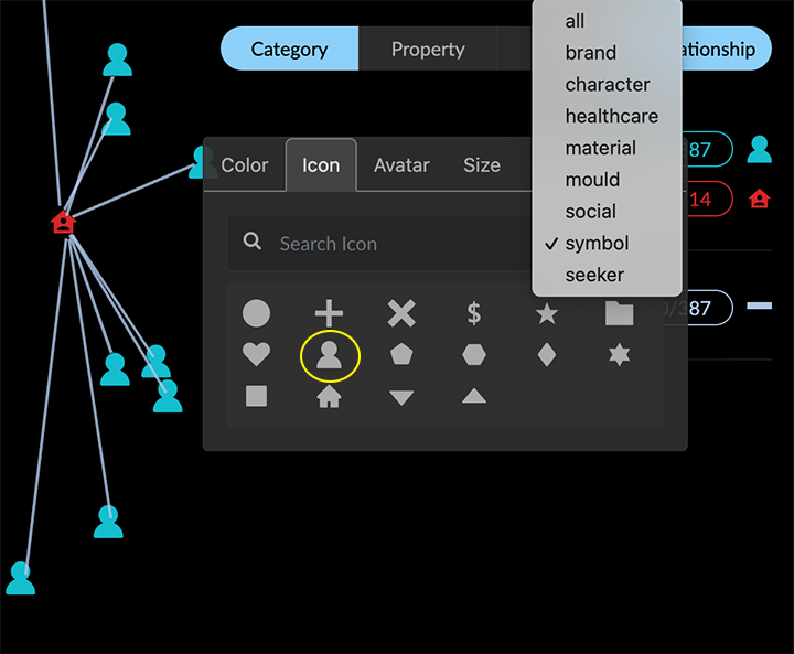
Click to select an icon for the category.
The new icon is applied to all the nodes of the Category, colored with your current color choice and mode.Click the x at the upper right to close the styling dialog.
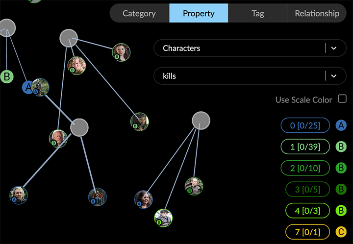
When an Avatar image is displayed on a node, the selected icon is reduced to a node badge.
Selecting an icon for the nodes with specific property values or tags
You can use the lists in the legend to apply an icon to nodes with specific property values. This can be useful, for example, to highlight specific values, or to show ranges of values more clearly.
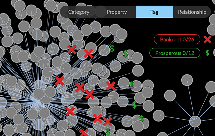
To select an icon for a property value or tag:
Go to the legend and click the Property (or Tag) tab.
Locate the property value in the list and click the colored dot at the right to display the styling dialog.
Click the Icon tab to display the icon picker. To locate icons, you can search by name, or use the dropdown menu to display a palette of similar icons.
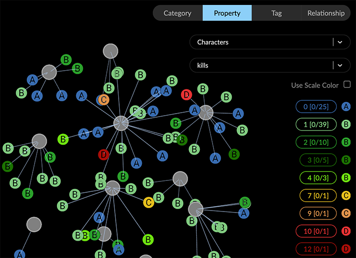
In the example above, Characters kills property values have been given an icon label of A (0 kills), B (1-4 kills), C (7 and 9 kills) , or D (10 or 12 kills), and each category is colored with similar hues (e.g. blue, greens, oranges, reds).
When an Avatar image is displayed on a node, the selected icon is reduced to a node badge.
Applying captions to nodes or edges
You can select one or more properties of a category or relationship whose values will be used as captions. Captions appear when the node or edge is close enough to your virtual viewpoint, and disappear when you navigate further away. The caption for each property you select is displayed on a separate line.
Often a property will have just one value, but multi-line property values are also supported, and are displayed in captions. A property with more than one value will display each value on a separate line.
Options for applying captions
You can apply captions in one of two ways:
Select one or more properties using the Caption tab in the styling dialog available in the legend’s Category and Relationship lists.
Click to select properties available for each category or relationship available in the Project panel and Category or Relationship tabs.
To apply captions using the legend’s styling dialog:
Go to the legend and click the colored dot or icon next to the item
To apply captions using the Project panel:
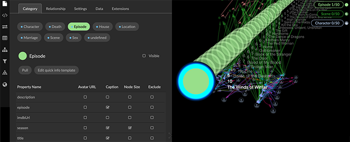
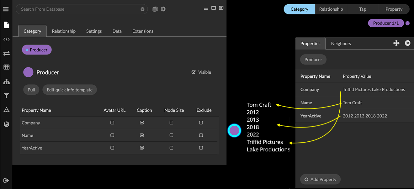
Go to the Project panel and Category or Relationship tab.
Click a Category or Relationship (e.g. Episode) to display its properties.
Click the Caption checkbox for the property to be used as a caption (e.g. title). The checkbox is available for any property.
If you select more than one property, the caption displays in the order you select the properties in the Property Name list. For example, a caption that includes the Episode’s property values for season, episode, and title appears as follows:

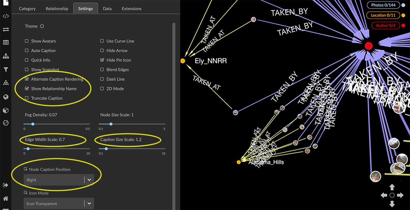
Global styling for captions
The Projects panel and Settings tab provides options to adjust the global display of captions:
Alternate Caption Rendering checkbox displays captions using an alternate rendering that may be more legible than the default rendering at very small text sizes. However, the number of captions which can be rendered at a time is limited.
Show Relationship Name checkbox displays the relationship name on every edge.
Edge Width Scale slider lets you adjust the global width of edges.
Caption Size Scale slider lets you adjust the global text size of captions.
Node Caption Position dropdown menu lets you adjust the position of captions on nodes. Position options are Right, Top (left-aligned or centered), Bottom (left-aligned or centered), and Vertical.